Tuesday, November 10, 2015

In-class Labs

In-class labs
~What arguments does the author make?
  • The argument that white people and people of color who are not black should not use the n-word
  • The argument that there are two separate conversations by black people and white people and as white people, we should not have anything to do with the conversation that black people are having about the n-word.
  • The author argues for a clear position against the usage of the n-word by any group of people who are not black.
  • The argument is not ambiguous or long enough to call for an in depth analysis. The author is extremely straightforward in his reasoning but he does use personal anecdotes as justification and evidence for his argument.
  • The author makes the argument that even beyond use of the n-word, terms such as “redneck” or any possibly racist slur shouldn’t be used by people outside of the “family.”


~How persuasive do you find the argument?
  • I think the argument is quite persuasive because it is very open, and only really displays facts and the author's opinion. The author is trying to persuade you that he is right, and he backs up his own personal opinions with facts and ideals that are current to the argument of racism.
  • The speech is void of any exact sources or links because of it being an oral presentation. Though the speaker himself is quite credible due to his extensive background in anti-racist writings and speeches since 1995. He also has been updating teachers about how to teach kids un-racist and anti-racist topics.
  • The argument is persuasive because he backs up his opinion well through facts and widely accepted ideas that cannot really be challenged without the challenger being considered “racist”.


~What is the author’s stance?
  • The author objectively describes how the use of the n-word should be only be used by colored people in contrast to a white person because otherwise it would be considered racist.


~Does the publisher bring a certain stance to the work?
  • In this case, there was not a publisher attached to the work. However, the argument was originally published in a book by the author, “White Like Me”. When just discussing the video, we have no publisher to consider. If we turn our focus to the book, we may find a stance that was brought by the publisher.
  • If you consider YouTube the publisher, the author had the ability to turn off comments (which he did), and that itself brought a support to racism and their claim, because since it is the internet it is guaranteed someone would have started a debate and been racist in the comments.


~Do you recognize ideas you’ve run across in other sources?
  • Technically not a source, but in my everyday life I have found this controversy a lot, from music the word is used in, to improper use. For me personally (Chloe), I have always had an issue with the idea of “I’m from ___ race, I can make fun of them!” and I think that this source helped better define this idea in a non-racist way.


~Does this source support or challenge your own position -- or does it do both? EVERYONE SHOULD ANSWER
  • Chloe: This source supports my position and makes me believe even more strongly in how people should not use racial slurs such as the n-word. However, the idea that people can depreciate their own people groups is an interesting way to state that, because before this source I didn’t agree with it (as mentioned in the last question).
  • Jacob: This source definitely supports my position. Right before viewing the video I knew the n-word was inappropriate to use in my vocabulary, and by watching the video it furthered my knowledge on why it’s wrong. It showed a unique perspective on how the word should only be used in its own color group, but even then it still seems like it dehumanizes the value of a given people.
  • Riley: This source supports my position. I agree with the arguments being made by Tim Wise in that the use of the n-word by white people like myself and other non-black people of color is inherently racist because of the historical context behind it. As a people, whites have used the word to continually dehumanize black people, whether it is through slavery, micro/macro aggressions, or even large scale institutionalized racism.
  • Corben: This speech supports my own personal opinions on racism. I believe that white people don’t have the “rights” to the n-word and trying to make it okay to use in “politically correct” context is not something good to do. Just leaving the n-word to colored people to use how how they see fit is the best option, we as white people used and abused the word and now we should have no say in the matter.
~What can you tell about how the intended audience and purpose?
  • As a white person this spoke to me on high levels. The purpose of the video was to inform the audience that the use of the n-word is not funny business, or cute, but in fact a still modern racially charged term that shouldn’t be used by white people.

In-class lab 2

Album Covers:
What do they suggest?
  • The female album cover is sexually suggestive, while the male album covers are more physically intimidating. In the male cover, the pictures almost have a cold and closed off feeling, while the female cover invites you closer.


How do they suggest it?
  • The female album cover has a woman staring at the camera, but slightly upwards, giving the viewer the impression of being looked up at. This establishes the power balance between the woman on the cover and the viewers, with the woman being submissive and the viewer being dominant. After establishing this, the album cover suggests a sexual element by having the woman’s hair fall messily in front of her face, having her shyly peek out from behind it. It also has the woman placing her fingers into her mouth, touching her lips. This draws attention to the mouth and creates a sexual undertone in the cover.
  • The male album cover shows the men being the focus of the cover. Both are standing in the center, staring forward. Unlike the female cover, the men are not looking up at the camera but either directly at it, or downwards. This creates the illusion that the men are either on the same level as the viewer or up above, putting them in a position of power. Neither men are being portrayed sexually, but as stand alone people, without connection to the audience at all. The men seem to be dismissive of any audience, with the left covering his eyes and puffing his cheeks outwards, making himself bigger and harder to connect with, and the right has his mouth closed tightly, with his chin slightly turned up as if he was challenging the audience or viewers. Both sides are lacking in an invitation to come forwards like the female cover had.
Which elements of each image work on the viewer in various ways?
  • The lighting, and shadows of the image captures  the viewer’s attention to the ideal stars.
  • The left rap cover album shows a more intimidation factor when looked at. The monotone colors and stark contrast create an essence of fear.

Rolex & Hello Kitty watches:
What do they suggest?
  • The Hello Kitty watch suggests childness, though it is not limited to children it is aimed at a child demography.
  • The Rolex watch suggests being elite.
  • Both suggest an easier way to keep track of time.
How do they suggest it?
  • The Hello Kitty goes about being childish by having simple designs that are more friendly. With the cartoon character on the watch face and circular, round edges suggest a more friendly appearance. Hello Kitty is a TV show about a friendly cat looking character, it is meant for children like the watch is meant for children.
  • The Rolex suggests it because there are many diamonds in the watch, and you have a good view of it’s fancy and expensive features. If you can buy such an expensive watch you are in an elite group of people.
  • The fact that they are advertising a product for watches usually suggests that people want to keep track of their time.
Which elements of each images work on the viewer in various ways?
  • The angles of the watches are important, because the Rolex watch being more front facing is showing off all of it’s components while still allowing it to look professional.
  • Hello Kitty watch is tilted more to the side and standing so it looks more “fun,” if a watch could be considered fun. It is a simple watch, so that angle brings most of the attention to Hello Kitty itself and not the other parts of the watch, since Hello Kitty is the selling point. Hello Kitty is also a fun character, and is a cartoon character and cartoons mainly represent fun and non-seriousness.


Brief Outline Album Cover:
Thesis: The images convey a message about the objects by using strategies to tell the consumer about their product, and why they should buy it.


Introduction: Give necessary background info, like the history of each person and then begin to describe the covers.


Body paragraphs:
Female album cover: How her position draws people in. How the cover uses sex to sell. Where the girl is looking, and how that asserts dominance.


Male album cover: How their positions make them look interesting. How the cover uses power to sell. Where the guys are looking, and how that asserts dominance.


Compare and contrast of the covers: physical aspects and how the covers impact people. If allowed more research, which album sold better and the possible connection to the covers.


Counterargument: How a different conclusion could be drawn and what the argument would use as support. How it’s valid, but not as effective or complete as the one we are making.


Ending: Tie in the most important parts of each body paragraph into the conclusion that draws from the thesis and intro paragraph. Make a closing argument that uses a summary of the evidence stated, making sure to have addressed each part of your thesis.


Brief Outline Watches:
Thesis: The images convey a message about the objects by using strategies to tell the consumer about their product, and why they should buy it.


Intro: The Rolex and Hello Kitty are on opposite sides of the watch spectrum. With Hello Kitty being the fun side of having a watch, and the Rolex shows that having just a simple tool to tell the time can be turned into more of a fashion statement and a status statement. Watches have become more than just something to tell the time with they have become a way to express your status, whether it's young and fun, or elite and serious.


Body Paragraphs
Rolex- Rolex is stating that to be elite is to purchase one of there watches. By having jewels surrounding the clock portion, and a metal band all around we see that the watch is trying to argue that you can’t be as fancy unless you have this watch.


Hello Kitty- Consider the consumer that they are trying to sell this watch to. It would be amined at a younger audience that is more familiar with the cartoon show Hello Kitty. Kids want stuff that has something to do with their favorite show. Having Hello Kitty on the watch face is a celebrity endorsement. Consider how this would affect the consumer and how this is effective or ineffective.


Both Watches: How both watches have things in common in their strategies to sell the product. discuss why they might have these in common. Both watches have in common that they are specifically aimed at a certain group of people. Though the consumers are different, one being kids and the other wealthy adults, the products are still geared toward a certain audience.


Counterargument: How another conclusion about the two images might have been drawn and how. Acknowledge this, and also tie it into your own argument, using the failings of the other to help support your own, which also creates a more effective air of authority.

Ending : Conclude your argument, addressing every part of your thesis and drawing the argument back into the introduction.

Thursday, November 5, 2015

In-Class Lab/ Collaborative Exercise

Positions I've formed today:

  • If writing on social media is a waste of time 
  • If a 2 hour drive is worth seeing a friend of mine
  • If I should leave an hour early so I can get to everything on time
  • If I should have done my hair this morning
  • If it's worth my time to get BO3
  • If my attempts at writing a book are good or not
  • If I should eat healthier meals
  • If I should start writing out my final draft today
  • If people in class texting me in class instead of talking to me when they can is immature (it is)
  • If I should take depression medication
Someone else taking a position:
  • Corben on Black Ops 3
  • My mom on letting me go to Auburn
  • Riley on wanting to go to school today (everyday)
  • Jacob on when he should start writing out his paper
  • The rest of the class on when they should start writing out their final draft
Meme Analysis

#1
http://www.grumpycats.com/like-a-good-neighbor/

Questions:
  1. How does it appeal to you-or why does it fail to appeal?
It appeals and it’s funny to me because it’s a jingle, but it’s not because it’s how a lot of people think of their neighbors, and because it’s relatable and a play on words it adds humor.

     2.) What kinds of words, images, or sounds does it use as support for its position?
This is a set of words that is a jingle or small musical line, though it doesn’t have any sound to it, most people know that it is sung to the sound of the State Farm jingle.

     3.) If you were going to revise it for a different audience, what would you do?
I would  change the style of fence to suit a more modern audience.  I would change the color of the font to something more interesting for a more whimsical or young audience.

     4.)  If you were going to create it in another medium, how would it be different?
If we were to, say, make it a state farm TV commercial, it would be much different because then it wouldn’t be as realistic, since the cat would probably have a voice actor or it would be silent and awkward. It works (really?) purrfectly (I mean rEALLy?) just to be one picture.


#2
https://www.pinterest.com/pin/292522938267517733/
Questions:
  1. How does it appeal to you-or why does it fail to appeal?
It appeals because many people defy law and talk on their phones while driving and it results in distraction that can rightfully cause the expression on the feline’s face.


     2.) What kinds of words, images, or sounds does it use as support for its position?
Just a picture is the perfect medium for this joke/comment because it’s the cat’s grumpy expression of disapproval and a fact most people would relate to by saying something stupid like “true.” or “same.”

     3.) If you were going to revise it for a different audience, what would you do?
Well, the joke really isn’t the same if you target the non-driving audience. So if I were going to aim it at non-meme-loving adults I would probably make it a serious commercial that everyone turns off.
     4.)  If you were going to create it in another medium, how would it be different?
If it was going to be in another medium it would be much different, because the cat would become a symbol for a people group or something overly complicated.

#3
http://cdn.smosh.com/sites/default/files/2015/03/pepe-gas.jpg
Questions:
  1. How does it appeal to you-or why does it fail to appeal?
It fails to appeal because of the overall tackiness of the image.
But it’s message is funny because it’s true.

     2.) What kinds of words, images, or sounds does it use as support for its position?
It has a line of text to caption the photo, describing what the photo is emotionally meant to be. It is not a description of any sort of scene, it is describing the emotion portrayed by this rare pepe meme.

     3.) If you were going to revise it for a different audience, what would you do?
I would use a more sophisticated image and give it a color background.

     4.)  If you were going to create it in another medium, how would it be different?
I would write it up as a joke.  So there would be more words and no image  or make it a comic type of meme with more panels.
#4     :D  https://instagram.com/p/5nY_eZCFoT/


Questions:
  1. How does it appeal to you-or why does it fail to appeal?
It appeals to me because despite feeling sad Pepe (the frog) was able to feel a sense of happiness in hearing his favorite jam.


     2.) What kinds of words, images, or sounds does it use as support for its position?
Pepe (the frog) has a top hat, and cane with a frowned expression while dancing which indicates that despite his sadness, he still has rhythm to his own favorite music choice.

     3.) If you were going to revise it for a different audience, what would you do?
See 4. Maybe for little kids it would be more funny, less sad, and a longer video.

     4.)  If you were going to create it in another medium, how would it be different?
I might make it a gif image, so that the pepe is dancing and tears are streaming down his face, it really portrays more emotion in motion rather than the still image.


Bibliography(s):

#1: Cat, Grumpy. “Like A Good Neighbor.”Cartoon. Grumpy Cats. 20 Feb. 2013. Web.11 November 2015.

#2: Marie, Candice.”Grumpy Cat Meme.“ Cartoon. Pinterest. 5 Nov. 2015. Web. 11 November 2015.

#3: sadfrogmemer. “Getting Online for the First Time in a Week Like” Cartoon. Smosh. 2014 Web. Nov 5, 2015.

#4: tcenews. “Sad Pepe Meme” Cartoon. Instagram. 26 July 2015. Web. 11 November 2015.

Taking Stock on Your Writing

Take stock of what you've written and learned by writing out answers to these questions: 
1.        How did you go about analyzing the text? What methods did you use—and which ones were most helpful? I broke down each ad individually, then used a basic compare and contrast style to split my thoughts into paragraphs. One of the easiest ways to break down the ads was the 7 questions you gave us to analyze the first ads, but another good way is to ask yourself "Who" "What" "Where" "When" "Why" and "How."
2.       How did you go about drafting your essay? My first draft was honestly mostly a brainstorm of ideas I wanted to put in my paper, then structured so it was a bit easier to follow. For my final draft, I will write my conclusion first and my introduction last so I better know how to explain why someone should read my paper after I've written it.
3.       How well did you organize your written analysis? What, if anything, could you do to make it easier to read?  I started with an example of how I analyzed part of an ad, then examined the physical aspects of each ad, followed by the overall message of both ads.
4.       Did you provide sufficient evidence to support your analysis? The two people who edited my paper seemed to agree with me I did.
5.       What did you do especially well? I organized it in an easy way and wrote my sentences individually so each was easy to understand.
6.       What could still be improved? My editors really wanted more on blood donation itself that backed my analysis, not just information on the ads. They wanted context to work from, since not much is known by the general public about it.
7.       Did you use any visuals, and if so, what did they add? Could you have shown the same thing with words? I forgot to put the pictures into my analysis, but when my editors and I both compared the pictures to my descriptions, they said both ads were described well.
8.       How did other readers' responses influence your writing? I think I've been writing the answer to that this whole time. My opinion is valid, but I also have a harder time understanding how my audience thinks than someone who is actually in my audience, so it has influenced my writing a lot.
9.       What would you do differently next time? I would pick a less "boring" topic, even if it was interesting to me. More fun facts about the topic will help in my final draft to keep my audience engaged.
10.   Are you pleased with your analysis? What did it teach you about the text you analyzed? Did it make you want to study more works by the same writer or artist? I am pleased with this analysis even though analyzing print ads is not my cup of tea. While it didn't make me want to analyze more ads, it did make me want to do more research on blood/organ donation.
11.   What are the transferrable  skills you can take from this into other writing situations? One of the best skills I gleaned from this is the way you can interpret something in many different ways, which will help me write characters better as I continue to write fiction. Another skill I learned is how easy it is to go a bit overboard on the analysis and dissect it too much until your claim doesn't match the topic. While this makes people want to avoid many poorly written analysis papers, this would make for an interesting way to brainstorm multiple plot lines for a story that all intertwine together.

Tuesday, November 3, 2015

Analysis Essay Rough Draft and Brain Storm


Blood Donation (ads v)


Blood Donation Ads Comparisons

Purposes of the ads: to get people to at least become aware of how helpful blood donations are, and to consider donation blood.

One of the ads (devianart) actually compared donating blood to something like immortality, because if you donate blood and the recipient outlives you, it’s as if your life force is still continuing.

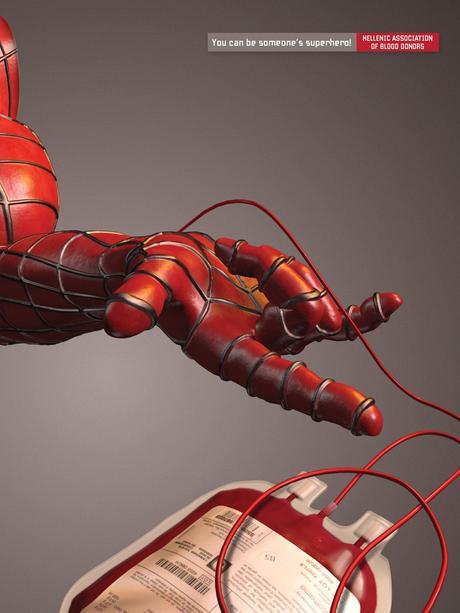
The other, the spider man ad, talks about feeling good after you’ve given blood because you can possibly save a life, and the feeling that goes along with doing a good deed makes you more likely to donate blood.


7 Questions (Spiderman):

1.       Who published this ad? Hellenic Association of Blood Donors

2.       Who is this ad appealing to? People who have a big heart and want to help and doesn’t have AIDS (or any other blood disease).

3.       How can we tell that? Because the one piece of text says “You can be someone’s superhero!”

4.       What is the purpose? To inspire people to donate blood.

5.       How do they seem to be working towards that purpose? By making you feel a sense of charity when you donate blood and goodness surrounding the whole idea.

6.       What evidence from the ad can you provide to support these answers? ^ The ad shows Spiderman connected to a blood bag, inferring that Spiderman was donating blood. Then the text further pushes this idea by saying you could be someone’s super hero, so if you were to donate blood to the client that got your blood you would be Spiderman.

 7 Questions (Drop of Blood):

1.       Who published this ad? NZBLOOD

2.       Who is this text appealing to? Anyone who wants to live a long life, which is most people.

How can we tell that? Because the text says “Make your life go further.”

3.       What is the purpose? To inspire people to donate blood.

4.       How do they seem to be working towards that purpose? The picture part of the ad is a drop of blood as if it was diluting into water, which could be inferred that one drop of blood could spread and help a sick person more than it helps you. Of course blood is donated in pints, so the idea that your life would go further because a person received a pint of your blood is very valid. If a child needs a blood transfusion and you donate blood which goes to the child, if the child got healthy again an extension of you could outlive your body.

5.       What evidence from the text can you provide to support these answers? ^ “Make your life go further.”


6.       Can you come up with a statement that would indicate what the ads do as a group?  The ads together make happy argument for donating blood, inspiring you with the idea that after you donate blood you will feel better and have a happier existence.


Analyzing Ads Paper

              When I was told to find a few ads to analyze, I was inspired to write about blood donation when I saw an ad done by the Hellenic Association of Blood Donors. Spiderman’s hand was connected to a bag full of blood, and the text beside the picture said “You can be someone’s superhero!” When I saw it the ad made me smile, and made me consider donating blood myself. Seeing something in such a positive light convinced me almost instantly, and I saw there were plenty more blood donation ads out there. So I picked another one that looked interesting and decided to analyze them by breaking down their components and looking at the overall message of these two ads.

              Looking at the two ads side by side, I was surprised by how similar the ads looked to each other, and most other blood donation ads I’d seen as well. Since one of the first things people think of when they see a dark red color is blood, I noted how both ads worked with a red and white color scheme. As I looked across google that was one of the themes I looked for in ads. If it followed this color scheme, chances were it was an ad supporting blood donations or a blood drive. Moving to the pictures themselves… If you’ve dripped food coloring into water, think about the shape of the drop a few seconds after it entered the water, think of the shape. The dye hasn’t diffused completely into the water yet, but it’s spread out and looks very cool. That is what the blood drop looks like on the ad done by NZBLOOD that I found. The picture was eye catching, and complained to the plain white backdrop, the multi-shaded drop of blood drew lots of attention to anything red. The other red parts of the ad were text, such as the words “Make your life go further,” and “Become a donor.” (I know this technically isn’t a blood donation ad, but after you die your blood if is good they use it.) It was simple but effective, and before any amount of research I considered being an organ donor.

              In the introduction I did a bit of analysis on the Spiderman ad, but there is more to the ad than the text. The picture is one of the most clever I’ve ever seen. It’s a picture of Spiderman’s arm, and his hand looks like he is about to shoot a web, but he’s giving blood. The little to no use of sharp colors such as white or bright red added to the effect of it seeming like a softer, more comforting picture. It reminds me of when Russel Wilson goes to see young cancer patients in the hospital, or the commercials of famous people coming to your door. Someone important is helping someone in need to draw awareness, and this works if the famous person is real or not. This may be a bit of overthinking, but I interpreted this paired with the text mentioning you could be a superhero, as saying that you could be the important person helping the person in need. That not only are you helping someone, but it improves your status. While that shouldn’t be the reason you donate blood, it very well is a reason people do. People post pictures of themselves at concerts and at the gym, saying “look at me my life is so great!” Well, if you post a picture of you after you’ve donated blood or talk about it a lot, people are more likely to think you’re a good person. It was a very well put together ad, to say the least.

              Finally, there is the main point of why these ads were made: to bring awareness. These people want you to consider using your resources you have an abundance of for a good cause. And who does this apply to? Anyone who wants to feel good about themselves, and help make a change for the better. I can’t think of a person this doesn’t apply to. These ads are fighting for the people who need blood and organ transfusions and asking us as a population to take a stand and help in the fight.

              Overall, these ads are very well put together and cleverly use our wants and desires to make us more inclined to agree with their ads. Since the cause they are fighting for is a noble one at it’s very core and purpose, people are more willing to go with these ads and allow themselves to feel a sense of charity for even considering following their cause.